Show the code
library(tidyverse)
library(haven)
library(hrbrthemes)
ess <- read_dta("ESS-Data-Wizard-subset-2023-10-29.dta")Earlier this week, the European Social Survey released topline results from ESS waves 6 and 10, on “understandings of democracy” (h/t to Pedro Magalhaes for tweeting about it).
These two waves, fielded in 2012 and 2020 respectively, asked respondents to judge how well their country did on different aspects of representative democracy, and how important that aspect was to democracy overall.
One of these aspects concerned the “political offer” in each country. Respondents were asked to what extent they agreed with the statement
“Different political parties offer clear alternatives to one another”
To me, this seemed like a question about party system polarization. If parties only have positions which are very close to one another on some latent dimension, these positions might not represent clear alternatives. Conversely, if parties have positions which are very far apart, these positions might be regarded as clear alternatives. Here, clear has to mean something like “distinct”, rather than “well-expressed”.1
I start by loading the European Social Survey data itself. For this I used the (genuinely quite wonderful) ESS Data Wizard, which allowed me to extract the questions I was interested in. If you want to run this code, you’ll need to amend this to reflect the filename generated for you.
library(tidyverse)
library(haven)
library(hrbrthemes)
ess <- read_dta("ESS-Data-Wizard-subset-2023-10-29.dta")I then aggregate this to create averages by country and wave:
smry_df <- ess |>
    filter(essround %in% c(6, 10)) |>
    group_by(cntry, essround) |>
    summarize(offer = weighted.mean(dfprtalc, pspwght, na.rm = TRUE),
              .groups = "drop") |>
    filter(is.finite(offer))
I want to plot these country averages, and to impose some kind of sequence on the plotted points. Rather than plot the values in alphabetical order of country, I’ll order countries in increasing order of their averages.
smry_df <- smry_df |>
    arrange(desc(offer)) |>
    mutate(cntry = fct_inorder(cntry),
           essround = factor(essround))
This enables me to create a simple dot plot showing the average for the two rounds of the ESS.
ggplot(smry_df, aes(x = cntry, y = offer,
                    shape = essround,
                    colour = essround)) +
    scale_x_discrete("") +
    scale_y_continuous("Agreement 0-10 scale") +
    scale_shape_discrete("ESS round") +
    scale_colour_discrete("ESS round") +
    geom_point(size = 2) +
    theme_ipsum_rc() +
    labs(title = "Agreement with 'Different parties offer clear alternatives'",
         subtitle = "Country averages for ESS rounds 6 and 10",
         caption = "Data: ESS / Graph: @chrishanretty") +
    coord_flip() +
theme(legend.position = "bottom") 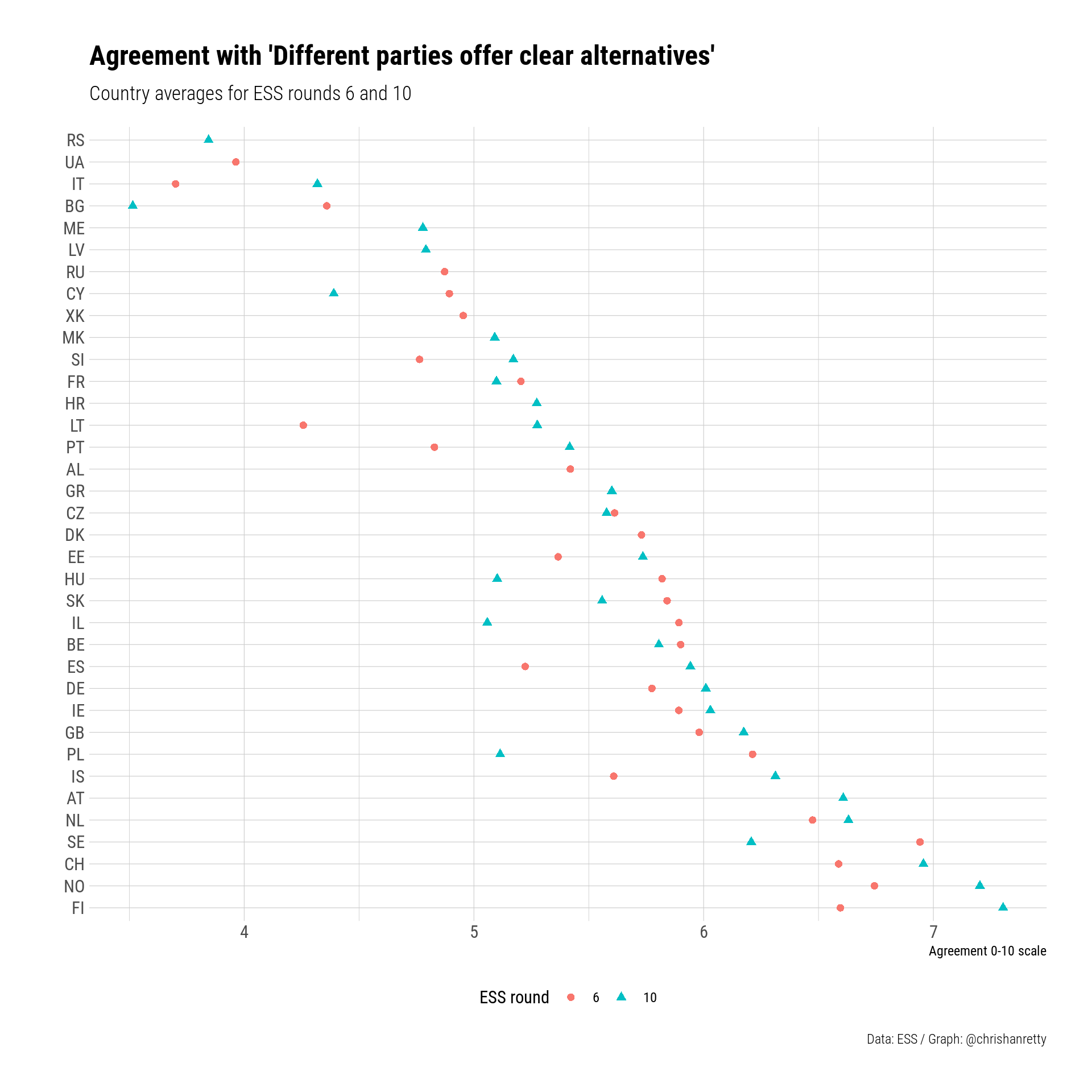
This chart doesn’t suggest anything in particular to me. I think of the countries at the bottom of the plot, where people agree more that parties offer clear alternatives, as being “rich countries”, rather than having any particularly distinctive party system or institutional configuration. Conversely all of the countries at the top of the chart tend to be on the poorer side, with Italy further down than its GDP per capita would suggest.
The ESS data is interesting in its own right, but eyeballing country averages will only get us so far. Ideally we would like to connect this information from the ESS to information about (i) election results and (ii) party positions.
My main source for election results will be ParlGov, which, for the countries in the ESS, offers the most comprehensive election results possible, and includes results for some parties with negligible vote shares (< 1%) or seat tallies.
if (!file.exists("view_election.csv")) {
    url <- "https://www.parlgov.org/data/parlgov-development_csv-utf-8/view_election.csv"
    download.file(url,
                  destfile = "view_election.csv")
}

pg_elex <- read_csv("view_election.csv")
Rows: 8947 Columns: 16
── Column specification ────────────────────────────────────────────────────────
Delimiter: ","
chr (6): country_name_short, country_name, election_type, party_name_short,...
dbl (9): vote_share, seats, seats_total, left_right, country_id, election_i...
date (1): election_date
ℹ Use `spec()` to retrieve the full column specification for this data.
ℹ Specify the column types or set `show_col_types = FALSE` to quiet this message.One odd feature of ParlGov, which catches me out on a semi-regular basis, is that it includes results not just for national parliament elections, but also for elections to the European Parliament. Because I believe in the second-order character of European Parliament elections, I’m going to ignore them, and focus on recent national elections.
pg_elex <- pg_elex |>
    filter(election_type == "parliament") |>
    filter(election_date > as.Date("2006-01-01"))
Although we’ve restricted the scope of our data somewhat, we’ll need to restrict it further. The ParlGov data includes results from elections in far-flung places like Australia, and whilst our Antipodean friends have made valient efforts to compete in Eurovision, they have not yet entered the European Social Survey. We’ll therefore exclude countries not included in the ESS, making sure to fix the country codes at the same time.
library(countrycode)
### Match country codes to ESS
pg_elex <- pg_elex |>
    mutate(cntry = countrycode(country_name_short,
                               "iso3c",
                               "iso2c")) |>
filter(cntry %in% smry_df$cntry)ParlGov gives us information on election results, but we also need information on party positions. I’ll be using measures of party positions from the V-Party project to capture the dispersion of party positions. I think the V-Party measures are the best measures of left-right position, and they also make their data available through an R package, which makes me even more favourably disposed to them.
library(vdemdata)
data("vparty")
We just want information on left-right position, the year, and an identifier for each party. The V-Party data has an existing party identifier v2paid, but it also includes PartyFacts identifiers. PartyFacts is an incredible project making linking datasets much, much easier. Let’s select the pf_party_id along with the left right measure v2pariglef.
vparty <- vparty |>
    filter(year > 2006) |>
    dplyr::select(pf_party_id, year,
                  v2pariglef)
We then download the PartyFacts information, which will enable us to link PartyFacts identifiers to ParlGov identifiers.
file_name <- "partyfacts-mapping.csv"
if( ! file_name %in% list.files()) {
  url <- "https://partyfacts.herokuapp.com/download/external-parties-csv/"
  download.file(url, file_name)
}
pf <- read_csv(file_name, guess_max = 50000,
               col_types = cols(
                   country = col_character(),
                   dataset_key = col_character(),
                   dataset_party_id = col_character(),
                   name_short = col_character(),
                   name = col_character(),
                   name_english = col_character(),
                   year_first = col_double(),
                   year_last = col_double(),
                   share = col_double(),
                   share_year = col_double(),
                   description = col_character(),
                   comment = col_character(),
                   created = col_datetime(format = ""),
                   modified = col_datetime(format = ""),
                   external_id = col_double(),
                   partyfacts_id = col_double(),
                   linked = col_datetime(format = "")
               )
               ) |>
    filter(dataset_key == "parlgov")
Warning: One or more parsing issues, call `problems()` on your data frame for details,
e.g.:
dat <- vroom(...)
problems(dat)Let’s now add on the ParlGov identifier to the V-Party data, and merge this information with the original ParlGov datase. This will report some errors, but these are unlikely to affect the parties we’re interested in.
vparty <- left_join(vparty,
                    pf,
                    by = join_by(pf_party_id == partyfacts_id)) |>
    mutate(dataset_party_id = as.numeric(dataset_party_id))
Warning in left_join(vparty, pf, by = join_by(pf_party_id == partyfacts_id)): Detected an unexpected many-to-many relationship between `x` and `y`.
ℹ Row 1114 of `x` matches multiple rows in `y`.
ℹ Row 1333 of `y` matches multiple rows in `x`.
ℹ If a many-to-many relationship is expected, set `relationship =
"many-to-many"` to silence this warning.pg_elex <- pg_elex |>
mutate(year = year(election_date)) |>
left_join(vparty,
by = join_by(party_id == dataset_party_id,
year == year))At this point, we’re likely to have measures for many parties, but we are unlikely to have measures for all parties. We can check the proportion of all entries for which we lack information:
mean(is.na(pg_elex$v2pariglef))[1] 0.6205828but since we are calculating seat- and vote-share weighted quantities, the more relevant quantity might be the seat-share or vote-share weighted proportion of missing data. Here I use the coalesce function as a quick way of replacing missing values in the weighting variables.
with(pg_elex,
     weighted.mean(is.na(v2pariglef), coalesce(vote_share, 0.0)))
[1] 0.3491592with(pg_elex,
weighted.mean(is.na(v2pariglef), coalesce(seats / seats_total, 0.0)))[1] 0.3066259In order to deal with the missing values that remain, we need an imputation strategy. My imputation strategy here is a relatively simple imputation strategy which involves imputed a (single) predicted value from a regression, and then imputing the election average for those values which still remain missing. This is reasonable for a blog post, but should not be used for an academic article. For an academic article you will need to multiply impute twenty data-sets, run your analysis on each data-set, and combine these estimates to get results which are not noticeably different, but which will satisfy reviewers.
Here’s the regression based imputation, predicting values of v2pariglef based on the (time-invariant) left_right measures from ParlGov, which average over multiple estimates from different years.
library(broom)
mod <- lm(v2pariglef ~ left_right, data = pg_elex)
pg_elex <- augment(mod, newdata = pg_elex) |>
    mutate(v2pariglef = case_when(is.na(v2pariglef) ~ .fitted,
                                  TRUE ~ v2pariglef))
and here’s the imputation using system mean:
pg_elex <- pg_elex |>
    group_by(election_id) |>
    mutate(v2pariglef = coalesce(v2pariglef, mean(v2pariglef, na.rm = TRUE))) |>
ungroup()At this point, we have a data-set which follows the ParlGov structure, and has a measure of left-right position for all parties. I’m now going to create my measure of polarization, which is equal to the vote- or seat-share weighted standard deviation of the positions. Whether I use the vote- or seat-share weighted figure doesn’t really matter: the two measures are virtually identical.
I coded up my own weighted standard deviation function, which is a standard deviation function for population data rather than sample data. Here it is. There’s some extra stuff there for handling missing values, but because of the steps we’ve just taken it’s not needed.
wtd.sd <- function(x, w, type = 1) {
### Population weighted standard deviation
### Make sure weights sum to one
    good <- !is.na(x) & !is.na(w)
    x <- x[good]
    w <- w[good]
### Make sure these aren't percentage points
    if (any(w > 1)) {
        w <- w / 100
    }
    if (type == 1) {
        w <- w / sum(w)
    } else {
        w <- w
    }
    meanlr <- weighted.mean(x, w)
    delta <- x - meanlr
    deltasq <- delta ^ 2
    wdeltasq <- w * deltasq
    swdsw <- sum(wdeltasq)
    sqrt(swdsw)
}
I then summarize this information to capture the polarization for each election. Just for the hell of it, I’ll also record information on the range of the positions of all vote- and seat-winning parties.
pg_elex.bak <- pg_elex
pg_elex <- pg_elex |>
    group_by(country_name_short, election_id, election_date) |>
    summarize(range_v = diff(range(v2pariglef)),
              range_s = diff(range(v2pariglef[seats > 0])),
              sd_v = wtd.sd(v2pariglef, coalesce(vote_share, 0.0)),
              sd_s = wtd.sd(v2pariglef, coalesce(seats / seats_total, 0.0)))
`summarise()` has grouped output by 'country_name_short', 'election_id'. You
can override using the `.groups` argument.We can now merge this summary table back on to the ESS using some of the join functionality in the tidyverse, and in particular the closest() function, which I only recently discovered. By “recently”, I of course mean, “whilst writing this blog post”.
smry_df <- smry_df |>
    mutate(fwk_date = case_when(essround == "6" ~ as.Date("2012-08-14"),
                                essround == "10" ~ as.Date("2020-09-18")))

pg_elex <- pg_elex |>
    mutate(cntry = countrycode(country_name_short,
                               "iso3c",
                               "iso2c"))

smry_df <- left_join(smry_df,
                     pg_elex,
by = join_by(cntry, closest(fwk_date >= election_date)))This has been a lot of work to create a data frame with fewer than 100 data points. However, it’s been worth it, because every part of our analysis pipeline can be easily replicated. Now that we’ve got our data in place, creating a scatter-plot should be the easiest thing in the world. The code below is a little bit more involved – there’s some automatic labelling of outliers – but it’s still just ggplot2 code for a scatterplot.
library(ggpubr)
smry_df <- smry_df |>
    filter(!is.na(sd_s))

mod <- lm(offer ~ sd_s, data = smry_df)
smry_df <- augment(mod, newdata = smry_df) |>
    mutate(is_outlier = abs(.resid) > 1)

ggplot(smry_df, aes(x = sd_s, y = offer)) +
    scale_x_continuous("Seat-share weighted polarization") +
    scale_y_continuous("Agreement on clear alternatives [0-10 scale]") +
    scale_colour_discrete("ESS round") +
    scale_shape_discrete("ESS round") +
    geom_point(aes(
        colour = essround,
        shape = essround),
        alpha = 4/5,
        size = 3) +
    geom_text(data = smry_df |> filter(is_outlier),
              aes(label = cntry),
              colour = "darkgrey",
              size = 4,
              adj = 0,
              nudge_x = 0.05) +
    stat_cor(label.x.npc = 0.8) +
    geom_smooth(method = "lm", formula = y ~ x, se = FALSE) +
    labs(title = "Party system polarization is weakly associated with\npopular perceptions of clear alternatives",
         caption = "Data: ESS / Graph: @chrishanretty") +
    theme_ipsum() +
theme(legend.position = "bottom") 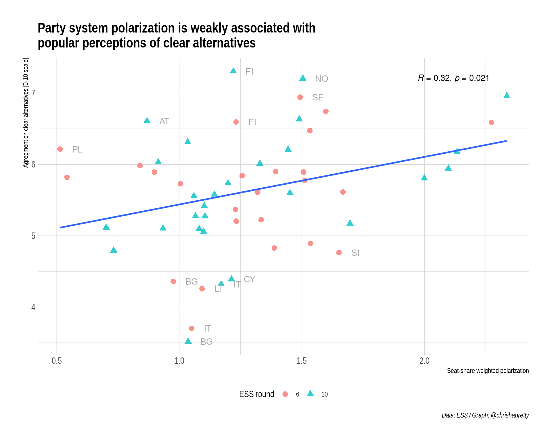
The scatter-plot shows a weak but positive relationship between party system polarization and perception of clear alternatives. The relationship is significant, although I should not that I’ve not modelled the non-independence of observations from the same country.
Why is the relationship not stronger? Some possibilities:
I’ve listed these possibilities in order of credence. I’m skeptical that a different dispersion concept would make much of a difference. Here’s a table with regression models which use the range rather than the standard deviation of party positions:
library(estimatr)
library(modelsummary)
library(kableExtra)

sd_s_mod <- lm_robust(offer ~ sd_s, data = smry_df, clusters = cntry)
sd_v_mod <- lm_robust(offer ~ sd_v, data = smry_df, clusters = cntry)
range_s_mod <- lm_robust(offer ~ range_s, data = smry_df, clusters = cntry)
range_v_mod <- lm_robust(offer ~ range_v, data = smry_df, clusters = cntry)

cm <- c('sd_s'    = 'Polarization',
        'sd_v' = 'Polarization',
        'range_s' = 'Range',
        'range_v' = 'Range',
        '(Intercept)' = 'Constant')

modelsummary(list(sd_s_mod,
                  range_s_mod,
                  sd_v_mod,
                  range_v_mod),
             coef_map = cm,
             statistic = "conf.int") |>
    kable_classic() %>%
    add_header_above(c(" " = 1, "Seat-share weighted" = 2, "Vote-shared weighted" = 2))
Seat-share weighted
|
Vote-shared weighted
|
|||
|---|---|---|---|---|
| (1) | (2) | (3) | (4) | |
| Polarization | 0.667 | 0.561 | ||
| [0.103, 1.232] | [−0.011, 1.133] | |||
| Range | 0.150 | 0.104 | ||
| [−0.080, 0.379] | [−0.119, 0.327] | |||
| Constant | 4.771 | 5.026 | 4.895 | 5.188 |
| [3.950, 5.591] | [4.008, 6.044] | [4.070, 5.720] | [4.205, 6.170] | |
| Num.Obs. | 53 | 51 | 53 | 53 |
| R2 | 0.100 | 0.035 | 0.070 | 0.017 |
| R2 Adj. | 0.083 | 0.016 | 0.052 | −0.002 |
| AIC | 131.1 | 131.4 | 132.8 | 135.8 |
| BIC | 137.0 | 137.2 | 138.7 | 141.7 |
| RMSE | 0.79 | 0.83 | 0.80 | 0.82 |
| Std.Errors | by: cntry | by: cntry | by: cntry | by: cntry |
Whilst the two polarization measures have a statistically significant relationship, the same is not true of the range of party positions, either in general or amongst seat-winning parties. Whilst it would be possible to calculate other more exotic measures of dispersion, a lot of these end up being very highly correlated with the weighted standard deviation.
What about the idea that the correlation is weaker than it ought to be because people aren’t very good at placing parties? Whilst it’s certainly true that most people aren’t good at placing parties, restricting the analysis to people who ought to be good at placing parties, because they report high levels of interest in politics, doesn’t really change our conclusions. Here I subset the data into people who are very or quite interested in politics. The correlation isn’t any stronger.
smry_hiint <- ess |>
    mutate(polintr = as_factor(polintr)) |>
    filter(essround %in% c(6, 10)) |>
    filter(polintr %in% c("Very interested", "Quite interested")) |>
    group_by(cntry, essround) |>
    summarize(offer = weighted.mean(dfprtalc, pspwght, na.rm = TRUE),
              .groups = "drop") |>
    filter(is.finite(offer)) |>
    mutate(fwk_date = case_when(essround == 6 ~ as.Date("2012-08-14"),
                                essround == 10 ~ as.Date("2020-09-18")))

smry_hiint <- left_join(smry_hiint,
                     pg_elex,
                     by = join_by(cntry, closest(fwk_date >= election_date)))

smry_hiint <- smry_hiint |>
    filter(!is.na(sd_s))

hiint_mod <- lm(offer ~ sd_s, data = smry_hiint)
modelsummary(list("All resps." = sd_s_mod,
                  "Those interested in politics" = hiint_mod),
             coef_map = cm,
             statistic = "conf.int") |>
kable_classic() | All resps. | Those interested in politics | |
|---|---|---|
| Polarization | 0.667 | 0.616 |
| [0.103, 1.232] | [0.072, 1.159] | |
| Constant | 4.771 | 4.978 |
| [3.950, 5.591] | [4.247, 5.710] | |
| Num.Obs. | 53 | 53 |
| R2 | 0.100 | 0.092 |
| R2 Adj. | 0.083 | 0.074 |
| AIC | 131.1 | 127.5 |
| BIC | 137.0 | 133.4 |
| Log.Lik. | −60.749 | |
| F | 5.176 | |
| RMSE | 0.79 | 0.76 |
| Std.Errors | by: cntry |
This leaves us with the third conclusion – that survey answers to questions about the clarity of alternatives aren’t cross-nationally comparable. This seems quite likely, but it’s hard to test it. One possibility is to test whether the association between polarization and perceptions of the offer is stronger amongst those who have spent time abroad. The ESS allows this to do us because it includes one variable wrkac6m which asks:
“In the last 10 years have you done any paid work in another country for a period of 6 months or more?”
smry_abroad <- ess |>
    mutate(wrkac6m = as_factor(wrkac6m)) |>
    filter(wrkac6m %in% c("Yes", "No")) |>
    filter(essround %in% c(6, 10)) |>
    group_by(cntry, essround, wrkac6m) |>
    summarize(offer = weighted.mean(dfprtalc, pspwght, na.rm = TRUE),
              .groups = "drop") |>
    filter(is.finite(offer)) |>
    mutate(fwk_date = case_when(essround == 6 ~ as.Date("2012-08-14"),
                                essround == 10 ~ as.Date("2020-09-18")))

smry_abroad <- left_join(smry_abroad,
                     pg_elex,
                     by = join_by(cntry, closest(fwk_date >= election_date)))

smry_abroad <- smry_abroad |>
    filter(!is.na(sd_s)) |>
    mutate(wrkac6m = droplevels(wrkac6m))

cm <- c('sd_s'    = 'Polarization',
        'wrkac6mNo' = 'No experience of working abroad',
        'sd_s:wrkac6mNo' = 'Polarization, no experience',
        '(Intercept)' = 'Constant')

abroad_mod <- lm(offer ~ sd_s * wrkac6m, data = smry_abroad)
modelsummary(abroad_mod,
             coef_map =cm,
             statistic = "conf.int") |>
kable_classic()| (1) | |
|---|---|
| Polarization | 0.846 |
| [0.252, 1.440] | |
| No experience of working abroad | 0.422 |
| [−0.710, 1.553] | |
| Polarization, no experience | −0.208 |
| [−1.048, 0.633] | |
| Constant | 4.374 |
| [3.574, 5.174] | |
| Num.Obs. | 106 |
| R2 | 0.116 |
| R2 Adj. | 0.090 |
| AIC | 274.5 |
| BIC | 287.8 |
| Log.Lik. | −132.252 |
| F | 4.459 |
| RMSE | 0.84 |
The slope on polarization, for those who do have experience, is higher (0.85) than the slope for those who lack such experience (0.85 - 0.21 = 0.64). Although this interaction is not statistically significant, it does seem as though it might be substantively meaningful. As such, it would be good if we had greater power to detect such an interaction, or if we could refine this dummy measure to capture the intensity of time abroad.
Public opinion regarding democracy is important. At the highest level of abstraction, if people within a country are not satisfied with democracy in that country, that is a problem for democracy in that country. However, the fact that people in country A are more satisfied with democracy than people in country B may or may not be a problem for people in country A. Sometimes, the people in country A just happen to be remarkably dyspeptic. One relatively robust finding in happiness research is that the French are less happy than anyone would expect given French GDP per capita. In this post, I’ve shown that there are only weak associations between one objective indicator related to representative democracy – the degree of party system polarization – and subjective impressions of the clarity of alternatives offered by different parties. I’ve implied that some countries just evaluate this question lower than others, and I’ve hinted that this effect is smaller amongst people who’ve spent time abroad. Researching the opinions of those who are equally familiar with the politics of multiple coutnries seems like an important priority for researchers interested in public opinion on democracy.
I checked the versions in other languages I understand: the Italian questionnaire is no help (alternative chiare), but the Swedish version talks about alternativ som klart och tydligt skiljer dem åt, which supports this interpretation of “clear”.↩︎