Code
dat <- dat |>
    group_by(iter) |>
    mutate(value.sc = value - min(value),
           value.sc = value.sc / max(value.sc),
value.sc = value.sc * 100)This week Rishi Sunak reshuffled his cabinet for the second time. The reshuffle allowed Sunak to get rid of Suella Braverman, who had ignored requests from Downing Street to temper criticism of the police in an article written for the Times.
Reshuffles serve several different functions. One important function is to signal a change in the political direction of the cabinet. Whilst most attention surrounds the liberal/authoritarian dimension of political competition, it’s also important to ask whether the cabinet reshuffle marks a shift in the cabinet’s position on economic issues.
With the data recently made available at mpsleftright.co.uk, we can do just that. In particular, we can check whether we can be confident, given the uncertainty in our estimates of MPs’ positions, whether any shift is in a particular direction. I’m not the first to do this, but in this post I’ll show how it can be done incorporating uncertainty in the estimates.
I’ll start by reading in the data. This data contains information on the values of each MPs’ position in different draws of the posterior distribution. Thus, rather than getting a single figure for each MP, we get 4,000 values.
This means that the data file is quite large, and is supplied as a zipped CSV file. I read this in using the read_csv function from the readr package. This allows me to read the compressed file directly without having first to unpack it.
The values in this file are not the same values you’ll find on the website. Those values have been scaled so that the left-most MP in each iteration is given a score of zero, and the right-most MP is given a score of 100. Let’s apply that scaling here.
dat <- dat |>
group_by(iter) |>
mutate(value.sc = value - min(value),
value.sc = value.sc / max(value.sc),
value.sc = value.sc * 100)We can now focus on the make up the Cabinet as it stood the Friday before the reshuffle. To ensure I pick out the right people, and don’t mistake my David Davis for my David (TC) Davies, I’ve included PublicWhip Person IDs in the mix.
dat <- dat |>
    filter(Party == "Conservative")

old_cab <- tribble(~Name, ~Person.ID,
                       "Rishi SUNAK", 25428,
                       "Oliver DOWDEN", 25323,
                       "Jeremy HUNT", 11859,
                       "James CLEVERLY", 25376,
                       "Suella BRAVERMAN", 25272,
                       "Grant SHAPPS", 11917,
                       "Alex CHALK", 25340,
                       "Claire COUTINHO", 25890,
                       "Michelle DONELAN", 25316,
                       "Michael GOVE", 11858,
                       "Steve BARCLAY", 24916,
                       "Penny MORDAUNT", 24938,
                       "Kemi BADENOCH", 25693,
                       "Therese COFFEY", 24771,
                       "Mel STRIDE", 24914,
                       "Gillian KEEGAN", 25670,
                       "Mark HARPER", 11588,
                       "Lucy FRAZER", 25399,
                       "Greg HANDS", 11610,
                       "Chris HEATON-HARRIS", 24841,
                       "Alister JACK", 25674,
                       "David DAVIES", 11719,
                       "Simon HART", 24813,
                       "John GLEN", 24839,
                       "Victoria PRENTIS", 25420,
                       "Jeremy QUIN", 25417,
                       "Robert JENRICK", 25227,
                       "Thomas TUGENDHAT", 25374,
                       "Andrew MITCHELL", 11115,
                       "Johnny MERCER", 25367)

old_cab <- left_join(old_cab,
                     dat,
                     by = join_by(Name,
                                  Person.ID))
We can now plot the mean position for MPs in the pre-existing cabinet. Here I plot a box-plot, which shows the median and upper and bottom quartiles, and I overlay the plotted points as part of a “beeswarm” plot.
plot_df <- old_cab |>
    group_by(Name, Person.ID) |>
    summarize(meanval = mean(value.sc, na.rm = TRUE),
              .groups = "drop") |>
    mutate(Cabinet = "Old cabinet")

ggplot(plot_df, aes(x = Cabinet,
                    y = meanval)) +
    scale_x_discrete("") +
    scale_y_continuous("MP left-right position") +
    geom_boxplot(width = 1/3) +
    geom_point(alpha = 1/2,
               colour = "#0087DC") +
    geom_text(data = plot_df |>
                  filter(meanval < quantile(meanval, 0.1, na.rm = TRUE) |
                         meanval > quantile(meanval, 0.9, na.rm = TRUE)),
              aes(label = Name),
              colour = "darkgrey",
              size = 3,
              angle = 60,
              adj = 1,
              nudge_x = -0.025) +
    coord_flip() +
    theme_solarized()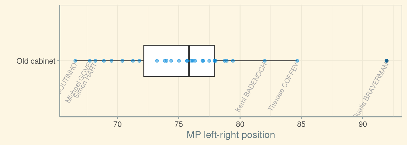
We can repeat these steps for the new cabinet:
new_cab <- tribble(~Name, ~Person.ID,
                   "Rishi SUNAK", 25428,
                   "Oliver DOWDEN", 25323,
                   "Jeremy HUNT", 11859,
                   "James CLEVERLY", 25376,
                   ## "David CAMERON", NA, ##
                   "Grant SHAPPS", 11917,
                   "Alex CHALK", 25340,
                   "Claire COUTINHO", 25890,
                   "Michelle DONELAN", 25316,
                   "Michael GOVE", 11858,
                   "Victoria ATKINS", 25424,
                   "Steve BARCLAY", 24916,
                   "Penny MORDAUNT", 24938,
                   "Kemi BADENOCH", 25693,
                   "Mel STRIDE", 24914,
                   "Gillian KEEGAN", 25670,
                   "Mark HARPER", 11588,
                   "Lucy FRAZER", 25399,
                   "Richard HOLDEN", 25893,
                   "Chris HEATON-HARRIS", 24841,
                   "Alister JACK", 25674,
                   "David DAVIES", 11719,
                   "Simon HART", 24813,
                   "John GLEN", 24839,
                   "Laura TROTT", 25851,
                   "Victoria PRENTIS", 25420,
                   "Robert JENRICK", 25227,
                   "Thomas TUGENDHAT", 25374,
                   "Andrew MITCHELL", 11115,
                   "Johnny MERCER", 25367,
                   "Esther MCVEY", 24882
                   )

new_cab <- left_join(new_cab,
                     dat,
                     by = join_by(Name,
                                  Person.ID))
We can, just as before, create a plot object which gives the mean figure for each MP in the cabinet. This of course leaves one the most notable appointment to the Cabinet, David Cameron. By leaving Cameron out when we calculate averages, we assume his position is identical to the average chosen.
new_plot_df <- new_cab |>
    group_by(Name, Person.ID) |>
    summarize(meanval = mean(value.sc, na.rm = TRUE),
              .groups = "drop") |>
    mutate(Cabinet = "New cabinet")
We can combine these two summary data frames in a single plot like so. Notable is the small differences, on economic left-right issues, between Suella Braverman and new minister for culture warsminister without portfolio Esther McVey.
plot_df <- full_join(plot_df, new_plot_df,
                     by = join_by(Name, Person.ID, meanval, Cabinet))

ggplot(plot_df, aes(x = Cabinet,
                    y = meanval,
                    colour = Cabinet)) +
    scale_x_discrete("") +
    scale_y_continuous("MP left-right position") +
    scale_colour_manual(values = c("royalblue", "darkgrey"),
                        guide = "none") +
    geom_boxplot(width = 1/4) +
    geom_point(alpha = 1/2) +
    geom_text(data = plot_df |>
                  filter(Cabinet == "New cabinet") |>
                  filter(meanval < quantile(meanval, 0.1, na.rm = TRUE) |
                         meanval > quantile(meanval, 0.9, na.rm = TRUE)),
              aes(label = Name),
              colour = "darkgrey",
              size = 3,
              angle = 60,
              adj = 1,
              nudge_x = -0.025) +
    coord_flip() +
    theme_solarized()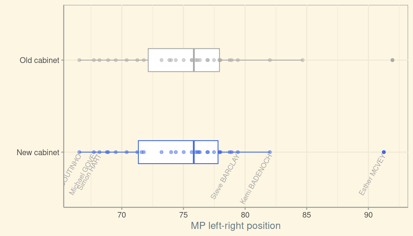
Just by looking at that plot, I can’t tell whether the median in the new cabinet is any different to the median in the old cabinet. Even if I could tell, the difference is small enough that this difference might be smaller than our ability to accurately measure MPs’ positions. It’s as if we were trying to cut cloth at a thickness of one millimetre, using a tape measure with only centimetre markings.
One way of tackling this problem is to average in a different way. Rather than averaging each MPs’ position across iterations, and then combining these averages to get (old and new) cabinet averages, we’ll get the average for (old and new) cabinet MPs in each iteration. We’ll then calculate the difference between old and new cabinet averages for each iteration. If, going iteration-by-iteration, the difference is consistently negative, then this would be good evidence that the new cabinet “really is” to the left of the old cabinet. Conversely, if the iteration-by-iteration differences were consistently negative, this would be good evidence that the new cabinet “really is to the right” of the old cabinet.
### Summarize by iter, then overall
old_cab_by_iter <- old_cab |>
    group_by(iter) |>
    summarize(meanpos = mean(value.sc, na.rm = TRUE),
              medianpos = median(value.sc, na.rm = TRUE),
              .groups = "drop")

new_cab_by_iter <- new_cab |>
    group_by(iter) |>
    summarize(meanpos = mean(value.sc, na.rm = TRUE),
              medianpos = median(value.sc, na.rm = TRUE),
              .groups = "drop")

comb <- left_join(old_cab_by_iter,
                  new_cab_by_iter,
                  by = join_by(iter),
                  suffix = c(".old", ".new")) |>
    mutate(median_delta = medianpos.new - medianpos.old,
           mean_delta = meanpos.new - meanpos.old)
We can then plot the distribution of these differences. Here’s the distribution for the median cabinet position.
ggplot(comb, aes(x = median_delta)) +
    scale_x_continuous("Difference in cabinet medians") +
    geom_density(fill = "royalblue", alpha = 1/2) +
    geom_vline(xintercept = 0) +
    theme_solarized()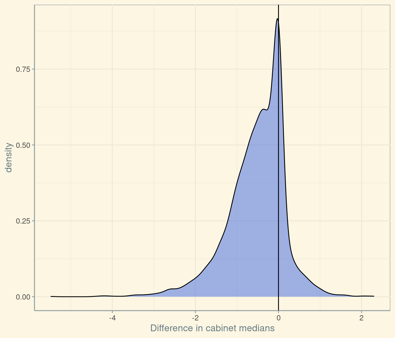
In this plot, 72 percent of the area is to the left of the solid line at zero. Another way of saying this, of course, is that the probability that the median position in the new cabinet is to the left of the median position in the old cabinet is 72%.
We can repeat this exercise for the “mean” cabinet position. Normally we would use the median, because statistically the median is more robust to outliers, and because substantively the median voter is uniquely powerful under majority rule. Whilst we might want our politics to be robust to outliers, “outlier inclusion” is sometimes a valuable goal in cabinet reshuffles.
ggplot(comb, aes(x = mean_delta)) +
    scale_x_continuous("Difference in cabinet mean") +
    geom_density(fill = "royalblue", alpha = 1/2) +
    geom_vline(xintercept = 0) +
    theme_solarized()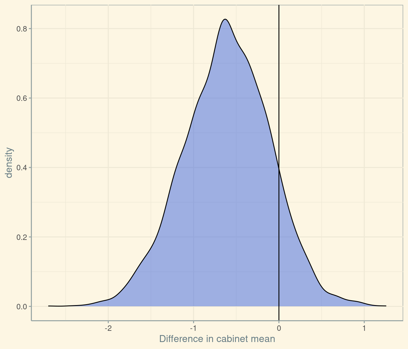
We can therefore say that the probability that the mean cabinet member in the new cabinet is to the left of the mean cabinet member in the old cabinet is roughly 89. If we were to translate this numerical judgement into plain English, we might say that “it is very likely that the new cabinet is to the left of the old cabinet on economic matters”. This, of course, is a judgement that most journalists could have reached intuitively – but which it is helpful to spell out here in a way that can be replicated by anyone who has access to the data on MPs’ placements.
We might at that point begin to ask, given that we can attach reasonable confidence to the new cabinet being to the left of the old cabinet, whether this difference is substantively significant. This is a separate question: some things we can estimate precisely but have no practical consequences, whereas some things may be a matter of life and death but subject to the greatest imprecision.
Answering this question involves more judgement. It would probably require us to think more carefully about the holders of different “economic” portfolios, and about the weight of each of these portfolios in decision-making. I think the answer is, “no, the difference is not substantively significant”. I think that there is a more substantive difference in terms not of economic left-right, but on cultural matters – but here we have to await measures of MPs’ opinion on these matters…